
In the past 24 hours, social media peeps as well as hardcore Instagrammers have been flooding the interwebs with flips and flak because Instagram just unveiled its new look.
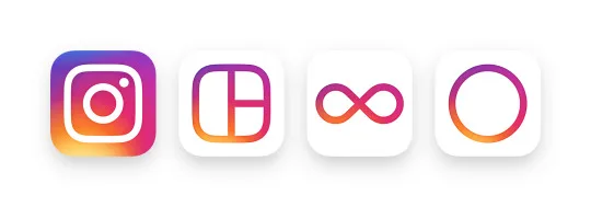
The popular image-sharing social platform, which is owned by Facebook, got rid of its vintage camera logo that everyone has grown to love (especially hipsters) and replaced it with an icon of a camera against a gradient of pastel colours.
Along with the new logo, a simpler, whiter user interface (read: minimalist) was also introduced. Apparently, the new design is meant to “put more focus on your photos and videos without changing how you navigate the app”.
Instagram’s reasoning behind this change? In a blog post announcing the refreshed look, Instagram said, “Inspired by the previous app icon, the new one represents a simpler camera and the rainbow lives on in gradient form. Our updated look reflects how vibrant and diverse your storytelling has become.”
And that’s not all! Instagram’s other creative apps e.g. Layout, Boomerang, Hyperlapse, were also bestowed similar rainbow-coloured icons.
But social media peeps aren’t buying it, and understandably so. When you’ve gotten so used to the way something is or looks for so long, an abrupt change may feel like a kick in the gut – especially if it’s your favourite app.
Adweek magazine called it a “travesty” and its Creative Editor Tim Nudd commented, “It may well go down as one of the biggest design fails of the year. It’s a very forgettable image that will get lost on people’s phones amid the thousands of other similarly uninspired designs of most tech apps. … Can we change it back?”
Closer to home, Malaysians have also expressed their dislike over the Instagram logo.
Fun fact: As of January 2015, there are 5,517,954 Instagram users in Malaysia.
Amongst the many comments by Malaysian Instagram users include, “Absolutely hideous.. how dare they call it staying true to the camera and rainbow.. where’s the rainbow? I don’t see more than hald the rainbow colours on it. No green, no blue.” and “Who thought that this was a good idea? Who thought of this idea in the first place? Bring the old icon back!” and “Great, Instagram found a elusive unicorn somewhere in the world and got it to vomit all over their app icons.” and “Why would any business change something that doesn’t immediately need fixing?”
And finally, “This is new-Kuala-Lumpur-logo level bad.“
It sounds like they’re ready to take the streets and picket for the old Instagram logo back. What do you guys think? Yay or nay to the new Instagram look? Will it eventually grow on you? Let us know in the comments below.
Meanwhile, we’ll leave you with this really cool gif of how the new Instagram logo was made. You’re welcome:
Sources: Instagram, Adweek, malaysiaasia.